MoveIt Pro
A robotics application platform featuring deployable AI, rapid development, and production-grade runtime.
Client
Platform
Timeline
Live Service
Design Synthesis
Project Overview
Objective
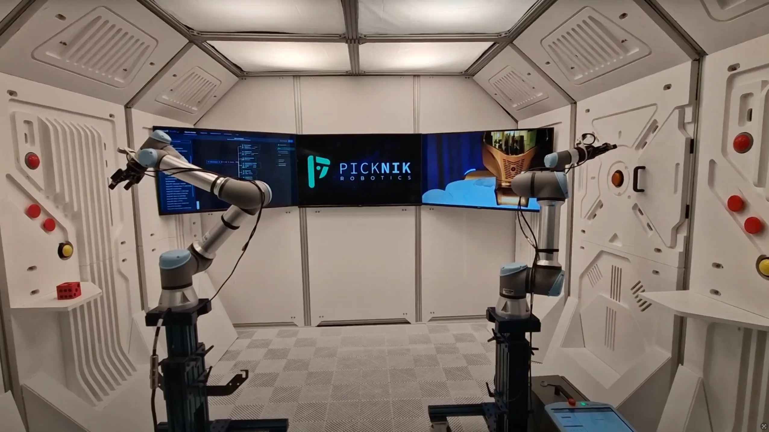
PickNik is a small robotics startup that has some truly unique software for very specific use cases. Their flagship product is MoveIt Pro, a software platform for visualizing, planning, and executing robot trajectories. However, they were having a difficult time getting users to adopt the software due to a lack of clear documentation and no interaction consistency needed for an intuitive user interface.
Team
| # | Role | Description |
|---|---|---|
| 1 | CEO / Product Owner | Responsible for defining the product vision and roadmap. |
| 1 | Principal UX Design Consultant (Me) | Responsible for creating the user interface and experience and maintaining consistency across the application and design system, conducting user research, and producing the visual design of the software. |
| 1 | Lead Engineer | Responsible for implementing the roadmap and ensuring the designs are technically feasible. |
| 2-4 | Developers | Responsible for building the frontend and backend of the application. |
My Mandate
| Directive | Description |
|---|---|
| Create & Maintain Consistency | Leadership was looking to create a consistent user experience across the entire software suite, including the behavior tree editor and the UI for running objectives. |
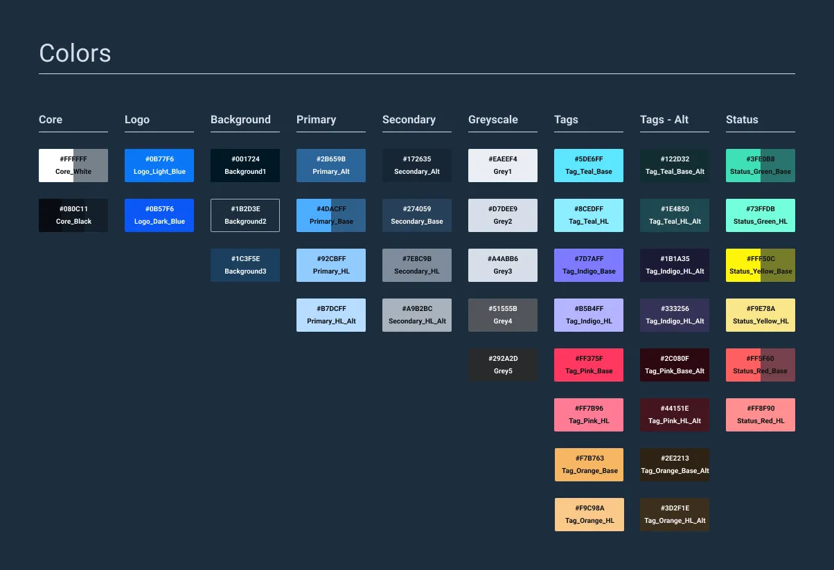
| Design System Creation | I was tasked with creating a design system that would be used by the entire team to ensure consistency across the entire software suite based on the existing Astro design system used by Space Force. |
| Navigation Structure & Layout | Along with the creation of the design system, I was tasked with creating a new navigation structure and layout for the software that would be more intuitive and easier to navigate. |
The main reason I was brought on to the project was to create a more consistent user experience across the entire software suite, including the behavior tree editor and the UI for running objectives. I was also tasked with creating a design system that would be used by the entire team to ensure consistency across the entire software suite based on the existing Astro design system used by Space Force. I would then maintain and add custom components to the design system as needed.
Discovery
Initial Insights
| Method | Participants | Core Insight |
|---|---|---|
| User Interviews | 9+ users across 3 different industries | Since the software was already live, I worked with existing users to gain insight into their workflow and pain points. |
| Astro Component Audit | N/A | I audited the existing Astro Design System to evaluate the components and see what could be used by default and what custom components were needed. |
| Engineer & Stakeholder Interviews | 20+ Internal Employees | To ensure all parties were in agreement I conducted interviews with the engineers and stakeholders to get their feedback on the current UI and what they would like to see changed. |
Problems Identified
After the initial insights, it became clear that many custom components would be needed. We also needed a general navigational structure that would be useful across multiple clients and industries. We needed to create a system that was flexible enough to handle the different workflows of different clients, while also being easy to use and understand with a reduced amount of clicks that were in the current UI. Additionally, it became clear that certain stakeholders were very opinionated about the design of the software and were not willing to compromise on their vision.
INCONSISTENT DESIGN PATTERNS
NAMING CONVENTIONS
SMALL IMPLEMENTATION TEAM
NAVIGATIONAL HIERARCHY
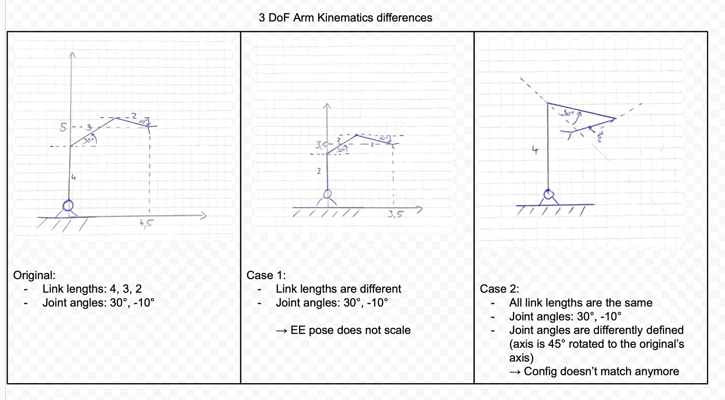
"Why is 'Pick & Place' a different objective than 'Grab & Move'? To me that's the exact same function..."
— Robotics Engineer, NASA
Proposed Solution
Being that the software was already live, we needed to create a solution that would be easy to implement and would not require a lot of changes to the existing codebase, at least during smaller updates. Instead, we would work on larger redesigns to be implemented during the big releases and focus on smaller consistency updates in between while also adding client-specific features as needed. We also agreed that spending time to create proper documentation and guidelines would be a worthwhile investment, as it would help the team and clients understand the software better while we reworked the overall structure.
Design
Personas
| User Group | Characteristics |
|---|---|
| Roboticist | • Highly educated, often a PhD graduate. • Incredibly technical and highly specialized in the field of robotics. • Has a deep understanding of the software and hardware required to build and operate robots. |
| Software Engineer | • Majority of the users. • Not all of them are experts in robotics or have a deep understanding of how to use the software to its full potential. |
| Non-robotics Specialist | • Rare among our clients. • These users were often in the field and not experts in the software. • Oftentimes would need to be trained on the software by the roboticists. |
Conceptual Framework
| Method | Description |
|---|---|
| Flow Diagrams | Created flow diagrams to visualize the different steps in the behavior tree editor and the UI for running objectives. |
| Site Mapping | Created site maps to visualize the different pages across the entire MoveIt Pro application to help simplify the navigation structure. |
| Whiteboarding | Sketched out the different concepts to help visualize the proposed components, focusing on their potential benefits and drawbacks, both from a usability and engineering perspective. |
Prototyping
| Component | Description |
|---|---|
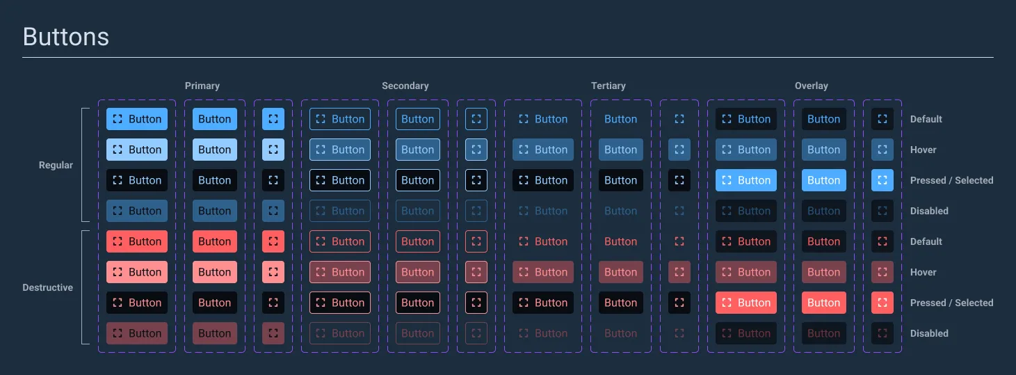
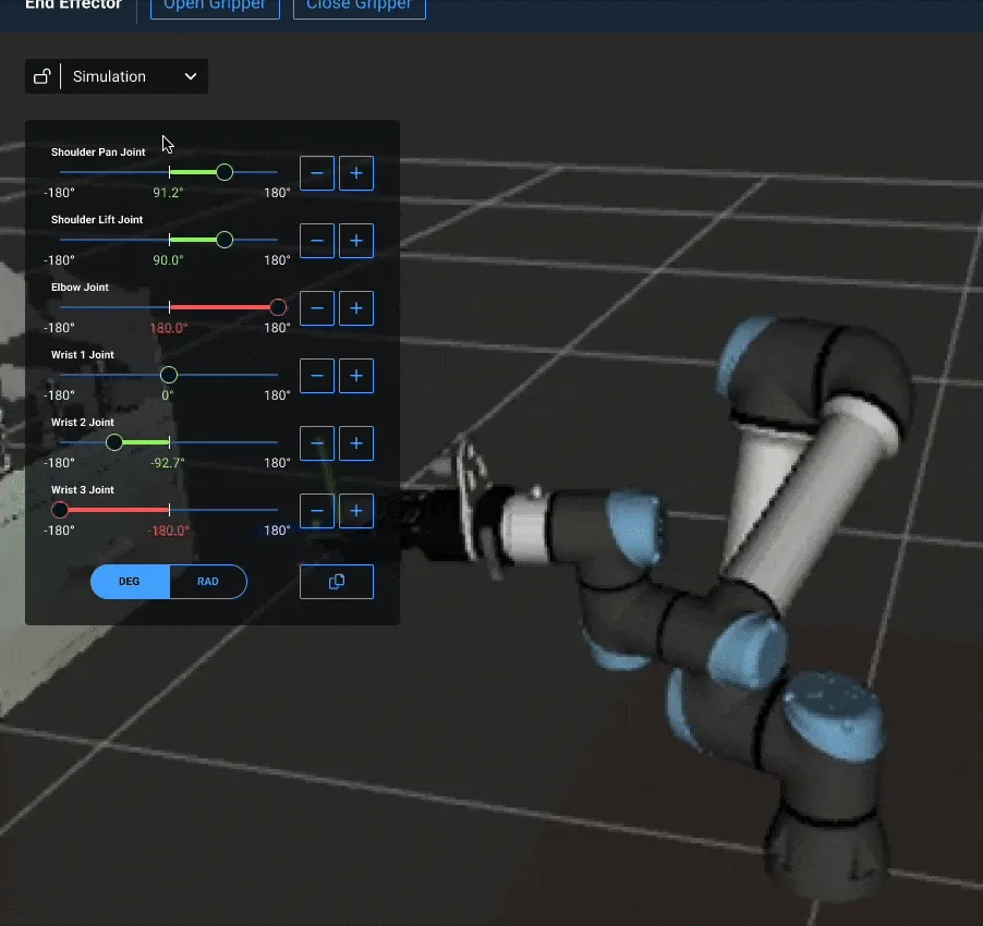
| Design System | Created a modern desktop-first design system (that still maintained best practices for touch interaction) that matched the existing Astro Design System used by Space Force. |
| Refined Navigation | Over time we completely removed the top navigation tabs to make it a seamless experience for running and editing objectives all from one main landing page. |
| W3C Compliance | Made sure all new components were fully compliant with the W3C standards for accessibility and usability. |
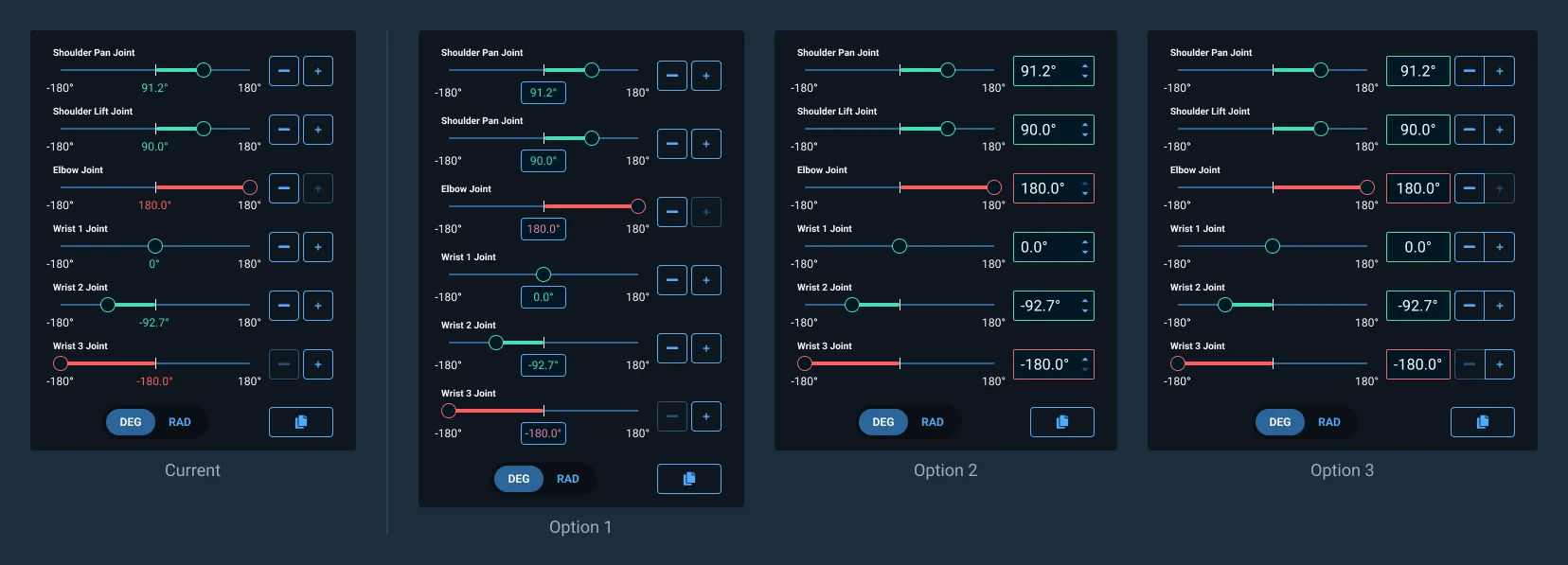
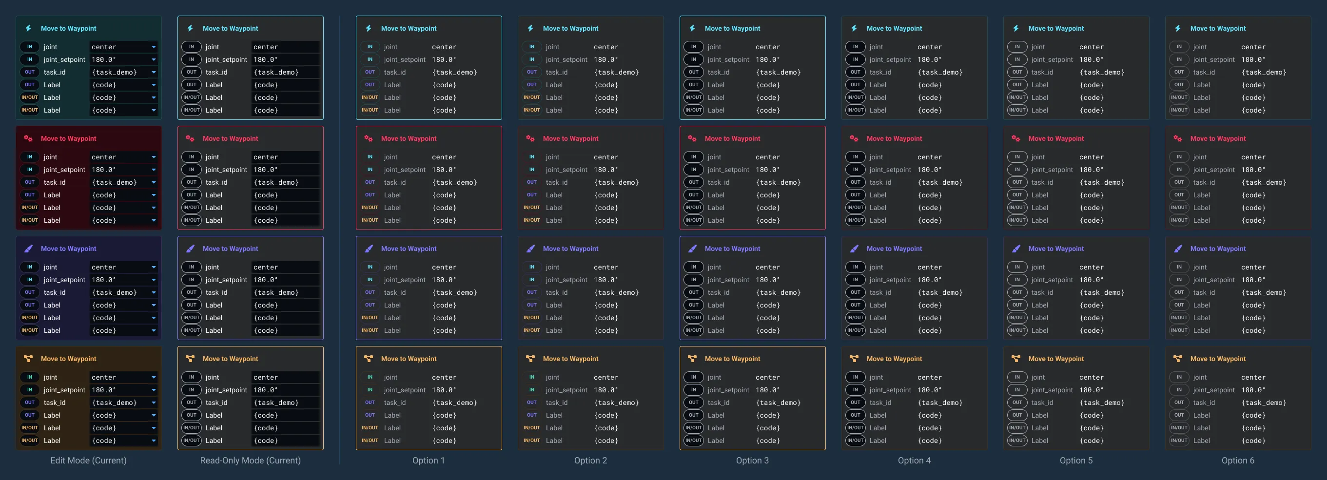
| Prototyping | Created multiple options for all new components to test with various clients, engineers, and stakeholders to ensure all parties were on the same page and to gather feedback on the new design. |
Testing
Evaluation
| Method | Description |
|---|---|
| User Testing | Conducted multiple user testing sessions with existing clients across a broad range of industries to make sure the new design would work across all different workflows and use cases. |
| A/B Testing | While the robotics industry is relatively niche, I was able to evaluate some users using our software against competitor software, specifically Groot and RVIZ. |
| Multiple Iterations | Iterated on the design multiple times based on the feedback from the testing sessions. |
Additionally, we conducted a content audit of the existing retail site to identify the different pages and how they were structured to help users find what they were looking for.
Iteration
| Iteration | Description |
|---|---|
| Design System | Continued to update the design system to be more consistent and modern, while also adding new components as needed. |
| Navigation Structure | Continued to refine the navigation structure to be more intuitive and easier to navigate. |
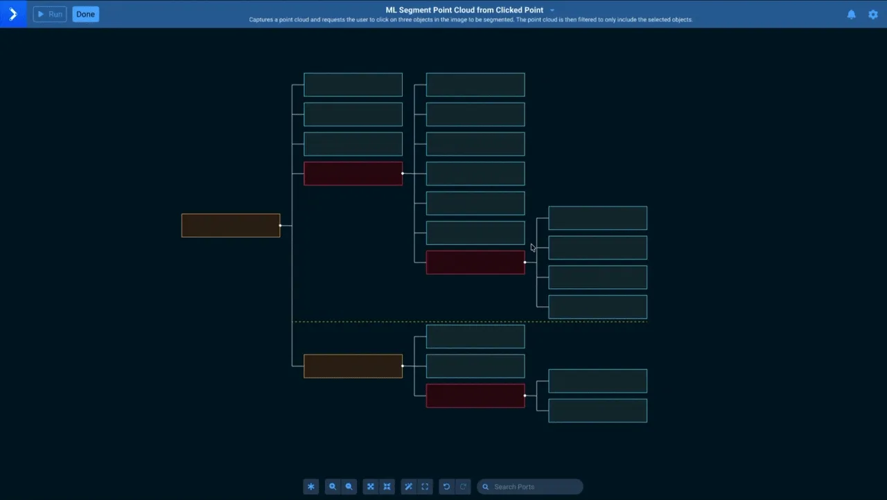
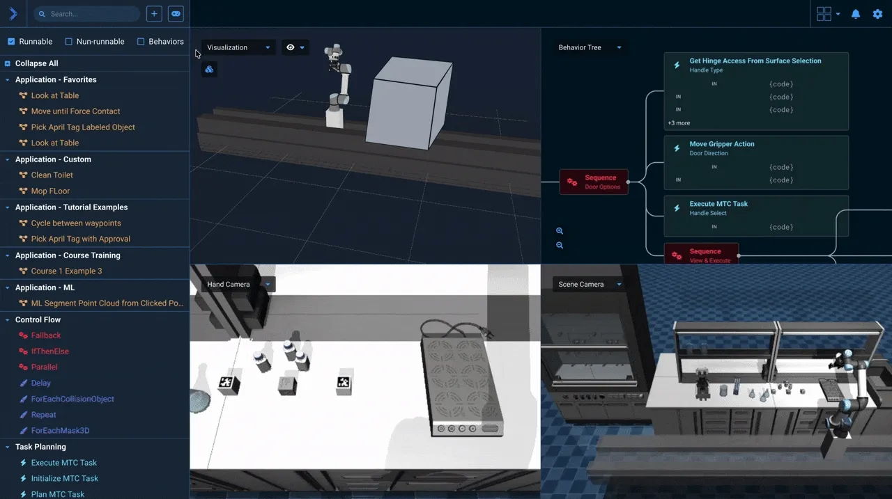
| Behavior Tree Redesign | Continued to redesign the behavior tree editor to provide a cleaner experience, adding quick-add functionality, removing the need for the static sidebar, and adding the ability to run the objectives from the tree builder for rapid development and debugging. |
Validation
Impact & Outcomes
Over the years, we were able to gather feedback from our internal team and most importantly, our clients to help us improve the software. While we never conducted a formal user satisfaction survey, we did receive a lot of positive feedback from our clients over multiple calls and meetings.
| Metric | Description |
|---|---|
| Time-on-Task Reduction | There was an overall time-on-task reduction as we eliminated many unneeded clicks and steps in the workflow. |
| Improved Documentation | We were able to create a more comprehensive documentation system that was easier to understand and follow, helping users get up to speed faster. |
| New Client Adoption | We were able to attract new clients to the software by showcasing the new features and improvements we were making and revamping the retail site to be more straightforward and easier to navigate. |
| Overall Satisfaction | We consistently heard positive feedback from our clients about the new features and improvements we were making. |
Reflection
Personal Growth
I spent over three years working on and off for PickNik, learning a lot about the robotics industry and the challenges that come with it. I would say this was absolutely the most challenging project in terms of understanding the needs of the user as the robotics industry is incredibly niche and specialized. There were additional challenges as well in working with a small team of engineers and stakeholders who were not always on the same page. However, I am incredibly grateful to the team for giving me the opportunity to work on this project and placing their faith in me to help them achieve their goals. It brought me to a new understanding of what I want to work on moving forward, specifically focused on smaller projects and design systems.