Chairside
A robust platform for managing and optimizing dialysis treatment for doctors, nurses, technicians, and patients.
Client
Platform
Timeline
18 months
Design Synthesis
Project Overview
Objective
DaVita wanted a complete redesign of their dialysis treatment software that would fit within the new CWOW (Center Without Walls) software suite. The legacy system ran on black-and-white DOS-based terminals that forced clinicians to manually navigate through every patient record via keyboard-only hotkeys and required 6 months of supervised training for new Patient Care Technicians (PCTs), which was costing the company millions of dollars in additional labor costs.
Team
| # | Role | Description |
|---|---|---|
| 1 | Product Owner | Responsible for defining the product vision and roadmap. |
| 2 | Subject Matter Experts | Provided expert knowledge and feedback on the project. |
| 1 | Scrum Master | Kept the team on track and ensured the team was working in an agile manner. |
| 1 | Lead UX Designer (Me) | Prototyped and designed the user interface and experience while maintaining consistency across the CWOW suite design system. |
| 2 | Secondary UX Designers | Assisted the lead designer with time-sensitive tasks and design reviews. |
| 3 | UX Researchers | Conducted user research and tested the prototypes with users. |
| 1 | UI Designer | Finalized the visual design of the application and ensured what the engineers built was pixel-perfect. |
| 1 | Internal Technical Lead | Managed the engineering team and worked directly with the UX team to ensure all designs were technically feasible. |
| 5+ | Developers | Built the frontend and backend components of the application. |
My Mandate
| Directive | Description |
|---|---|
| Enhance Usability | Reduce treatment setup and monitoring time for doctors, nurses, and PCTs. |
| Maintain Consistency | Ensure the program synchronizes in both form and function with all other CWOW-related applications, including health records, patient portal, treatment plans, and supply/medication orders. |
| Reduce Training Time | Reduce the time required to train new PCTs by at least 30%. |
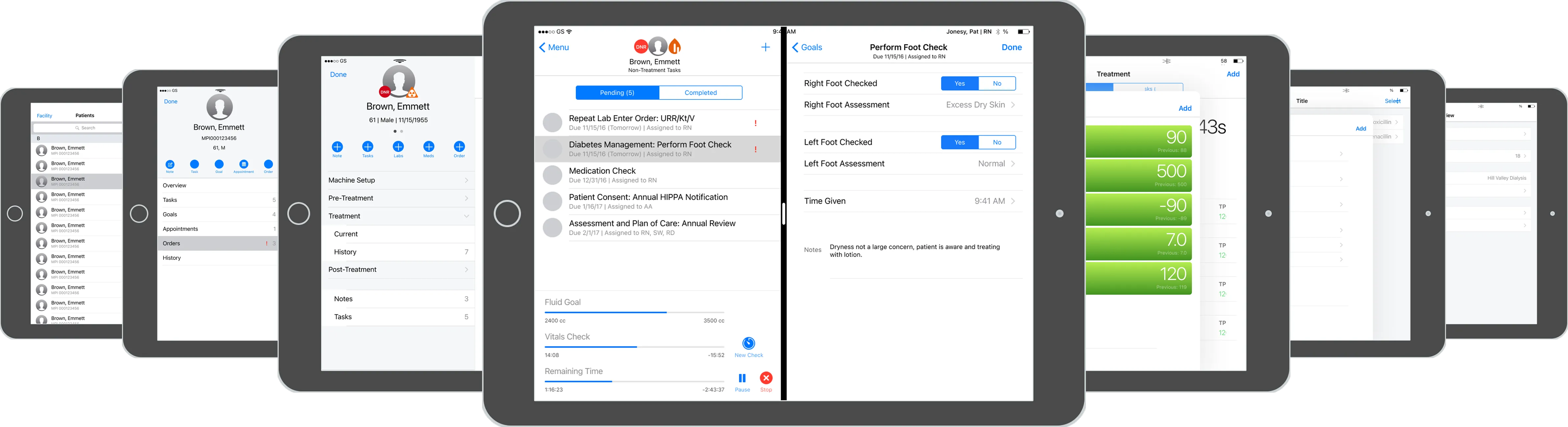
This project was unique in that I was given an additional mandate at first: tablet-first design. The executive stakeholders wanted to see if it was possible to provide existing functionality on an iPad in order to pursue a big partnership with Apple. I was put in charge of two UX designers who helped me create this 100+ screen interactive proof of concept using Apple components over a single week.
Discovery
Initial Insights
| Method | Participants | Core Insight |
|---|---|---|
| User Interviews | 3 doctors, 11 senior nurses, 30+ PCTs | While the iPad was seen as “cool,” there was a clear practical preference for stationary devices; tablets introduced new hygiene concerns. |
| Field Testing (iPad prototype) | 30+ PCTs | Glove-touch failure → average 300 glove swaps per shift per user. |
| Contextual Inquiries (on-site) | 30+ patients observed | Need instant vitals comparison (pre/in/post) without leaving the screen. |
| Working Sessions with Apple | Our UX team along with three UX designers from Apple | We traveled to Cupertino, CA to work directly with Apple’s UX team to get their feedback on the project and how it could be integrated into their products. |
Problems Identified
While we had succeeded in creating the proof of concept, we had also discovered via initial user feedback that using a tablet was not only problematic for multiple reasons:
HYGIENE CONCERNS
SPEED ISSUES
MEDICAL EQUIPMENT
"I want to see everything! It's a hassle to have to constantly scroll up and down while also managing needles or medications."
— Anonymous Nurse
Proposed Solution
With the data documented, we returned to the executive stakeholders and suggested we pivot the project to a desktop application or offline-first web-app. Our proposal was that it would simply enhance the functionality of the existing kiosk, but with the added benefit of being able to be used on any device with a web browser, so that nurses and doctors could do certain actions from their laptops or tablets without having to use the kiosk. This was obviously met with a lot of pushback from the executive stakeholders, who wanted to see their dream of a tablet-first solution come to fruition. However, with the full support of both the UX and engineering teams, and most importantly, the users themselves, we were able to push back and get the project approved as an offline-first web-app.
Design
Personas
| User Group | Characteristics |
|---|---|
| Doctor | • Typically visits patients only when needed. • Not always on-site during treatment. • Needs to be able to review historical data and treatment plans. |
| Nurse | • Problem solving during treatment. • Juggling multiple patients and tasks. • High stress environment. |
| PCT | • Focus on efficiency. • Get the patients started on treatment as fast as possible. • Rapidly jumping between patients. • Hygiene-heavy. • High turnover rate. |
Conceptual Framework
| Method | Description |
|---|---|
| Device Discovery | With the executive team on board, we conducted a discovery of the different devices that were available to help us increase the efficiency of the existing kiosks, specifically focusing on larger monitors that could display the maximum amount of information to the user. |
| Flow Diagrams | Created flow diagrams to visualize each core part of the treatment process. |
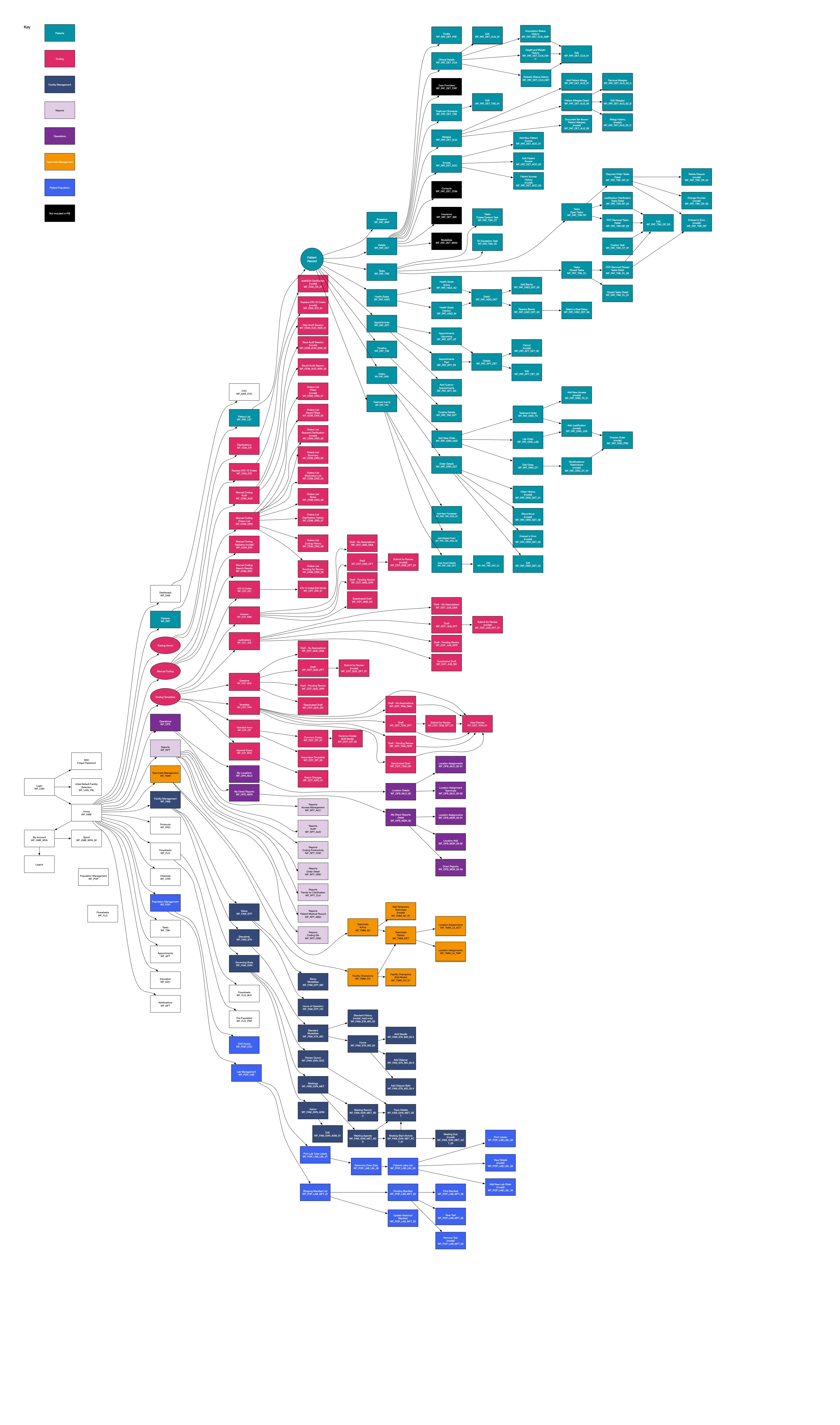
| Site Mapping | Created site maps to visualize the different pages across the entire CWOW suite. |
| Whiteboarding | Sketched out the different concepts to help visualize the proposed components, focusing on their potential benefits and drawbacks, both from a usability and engineering perspective. |
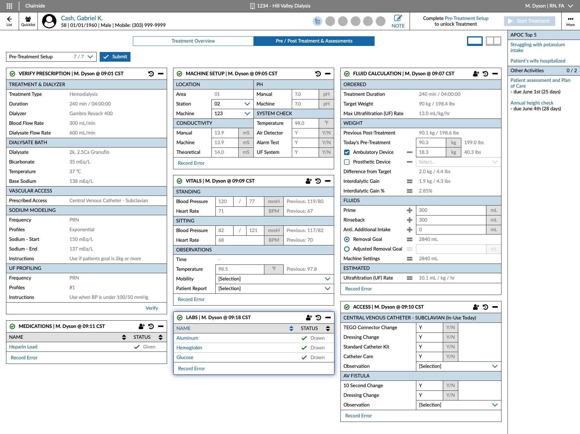
Prototyping
| Component | Description |
|---|---|
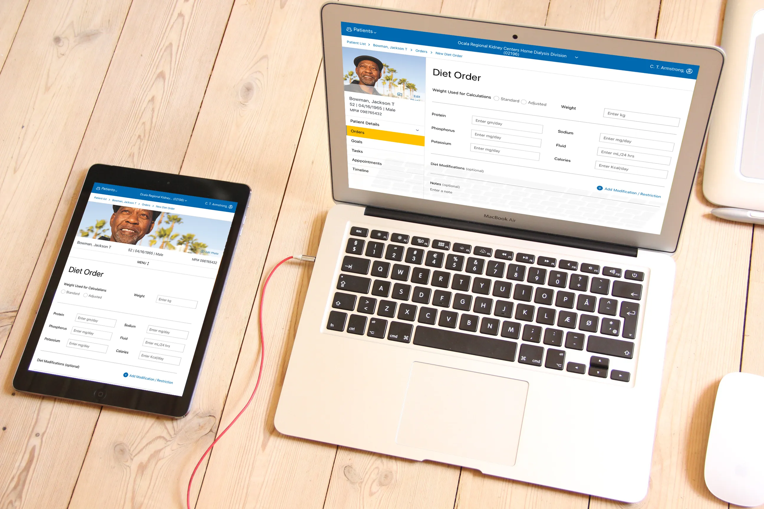
| Design System | Created a modern desktop-first design system (that still maintained best practices for touch interaction) to be used by the entire team across all parts of the CWOW product suite to ensure consistency. |
| Information Architecture | Restructured the existing system for the web app that was more intuitive and easier to navigate. |
| Visual Design | Our UI team worked directly with us and the engineers to create a more consistent and modern design that also showcased the company brand. |
| Device Integration | • Widescreen Monitors: With the current kiosk hardware being extremely outdated, we landed on using larger monitors to display the maximum amount of information to the user. • Mouse Functionality: Added the ability for clinicians to use a mouse to assist in navigating the new UI while learning hotkeys (especially helpful to new users). |
Testing
Evaluation
| Method | Description |
|---|---|
| User Testing | Conducted multiple usability tests across the country with all user groups to ensure the new design was intuitive and easy to use. |
| A/B Testing | Conducted A/B testing to compare the new design with the existing desktop kiosk to determine if the new design was actually faster and more efficient. Additionally, we tested the new designs with the proposed mouse and monitor device integrations to ensure maximum functionality. |
| Feedback Analysis | Analyzed the feedback from the testing sessions with the subject matter experts, engineers, and executive stakeholders to make sure all concerns were addressed and the new design was ready for production. |
"It isn't a straight through process, we just want to get the patient started as quickly as possible, and deal with the extra stuff later."
— Anonymous PCT
Iteration
| Iteration | Description |
|---|---|
| Design System | Altered the design system to have specialized components for Chairside specific features since it functioned differently than the other CWOW applications. |
| Information Architecture | Revamped the information architecture to allow for swappable side-by-side views of the patient’s vitals and treatment steps. |
| Visual Design | The visual design was updated to be larger, allowing users to clearly read the monitor from further away since they were often focused on the patient and not the screen itself. |
| Device Integration | Discovered that a trackball mouse was ideal instead of a standard mouse as the kiosks had very little space for movement. |
Validation
Impact & Outcomes
While I did get to see the success at our pilot location, I unfortunately left the company for my next position before the final rollout of CWOW and Chairside. However, it was extremely well received by the initial test clinics, and in talking with my former colleagues in the years since, they informed me that as of 2020, nearly every clinic in the country was using the new software.
~30%
Time-on-Task Reduction
~84%
Training Time Reduction
92%
Adoption
4.87 / 5
Overall Satisfaction
| Metric | Description |
|---|---|
| Time-on-Task Reduction | ~30% per patient, meaning users were able to spend more time treating the patients directly rather than managing the kiosk and patient records. |
| Training Time Reduction | Nearly an ~84% reduction in training time for new PCTs, taking the required supervised training time from 6 months to around 1 month, saving millions of dollars in labor costs. |
| Adoption | 92% of pilot clinicians rated the app “essential.” |
| Overall Satisfaction | 4.87 / 5 stars from dozens of clinicians surveyed across the country. |
Reflection
Personal Growth
This was a challenging project to work on, but it was also a lot of fun. I learned pretty much everything there is to know about dialysis treatment and HIPAA compliance without being a medical professional. I also learned how to balance the wants of the business, the technical feasibility from the engineers, and most importantly, the needs of the users. I also learned a lot about the importance of Agile methodologies and how to work with a team to deliver a product on time and on budget. This project remains the one I’m most proud of to this day and I’m forever grateful to have been a part of it.